Tables
Incorporating tables in your email signature is crucial for achieving a consistent layout across various email clients and screen resolutions. This helps ensure that your email signature maintains a professional and polished appearance, regardless of the platform or device on which it is viewed.
Sigsync provides a range of customizable table components, allowing you to tailor your email signature design to your unique preferences while maintaining a consistent and polished appearance across all platforms.
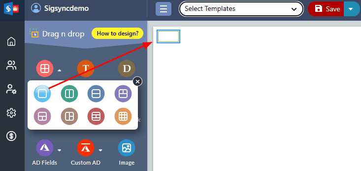
Table with single row and single column
The 'Table with single row and single column' allows you to quickly insert a single row and column table in the signature design area. You can use this as a basic layout for your template, or insert it where individual signature fields need to be placed.
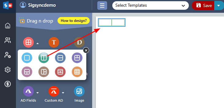
Table with single row and two columns:
The 'Table with single row and two columns' is a pre-formatted table that includes a single horizontal row and two vertical columns. This table is designed to provide a simple and efficient way to insert a basic layout into the signature design area or to place individual signature fields.
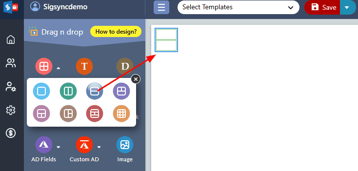
Table with two rows and single column:
The ‘Table with two rows and a single column’ is a pre-designed table that consists of two horizontal rows and one vertical column. It is often utilized to present significant details regarding a signature, such as the signer's name, job title, or contact information. This table format can be easily customized and used to display different kinds of data such as legal disclaimers, company information, and other important details.
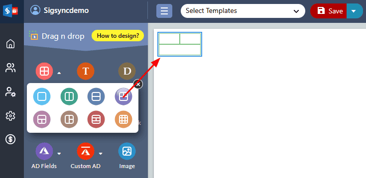
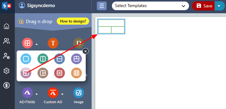
Two rows with merged columns on the second row:
This predefined shape consists of two rows and two columns, with the cells in the second row merged into a single cell. The left cell of the first row can be used to insert a profile photo or any other image, while the right cells of the first row can be used to display personal and contact information such as name, job title, phone number, and email address etc.
The second row of the shape, which is a single merged cell, can be used to add a disclaimer text or banner image. This can be useful if you want to add a legal disclaimer, a promotional banner, or any other message that you want to highlight in your email signature.
Two rows with merged columns on the first row:
This predefined shape is composed of two rows and two columns, wherein the cells in the first row are merged to form a singular cell. The first row, which consists of the merged cell, serves as a space for adding personal information such as the individual's name and job title. The left cell in the second row can be utilized to insert a profile photo or any other desired image, while the right cells of the second row can be utilized to provide contact information such as phone numbers, email addresses, and the like.
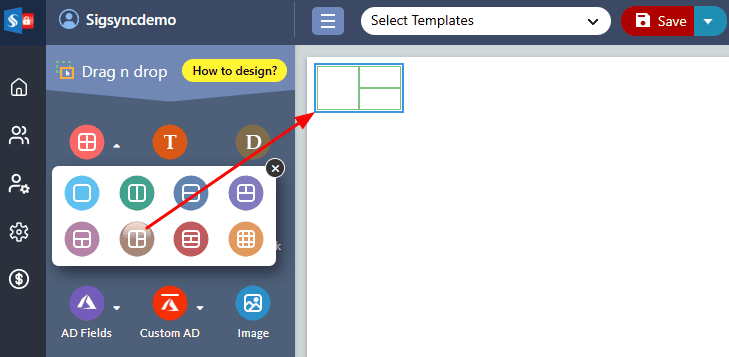
Two columns with merged rows on the first column:
This predefined shape consists of two columns and two rows, with the cells in the first column merged into a single cell in both rows. The merged cells in the left column can be used to insert a profile photo, while the right column has two separate cells that can be used to insert personal and contact information.
The first cell of the right column can be used to insert personal details such as name, job title, and company name. The second cell of the right column can be used to insert contact and address details such as phone number, email address etc.
This shape is particularly useful when creating an email signature that includes a profile photo and personal and contact information. With this predefined shape, you can easily customize the layout and formatting to match your branding and style.
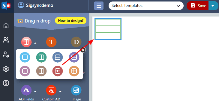
Three rows with middle row having two columns:
This predefined table shape has three rows and two columns in the middle row. The first row can be used to insert personal details such as name, job title, and company name. The middle row consists of two cells, where the left cell can be used to insert a profile photo and the right cell can be used to insert contact details such as phone number, email address, and physical address.
The last row of the table can be used to insert a disclaimer or banner image, providing a convenient way to display a message or image that you want to highlight in your email signature.
Custom Table:
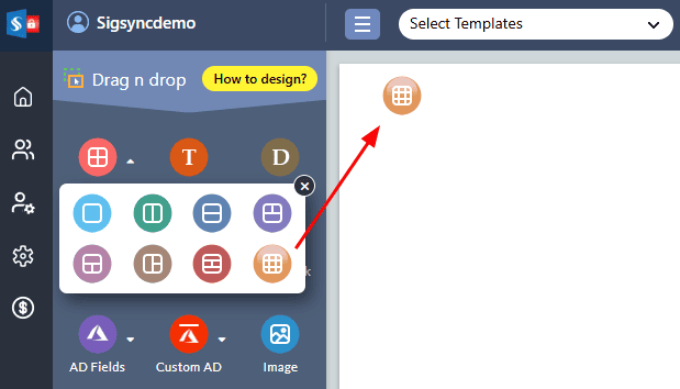
If your signature consists of multiple fields such as personal details, contact details, social media links etc. in a different number of columns and rows, Sigsync provides a ‘Custom Table’ option to structure and organize the multiple fields in a visually appealing manner.
If you want to add a custom table to your email signature template, here are the steps you can follow using the Sigsync Editor:
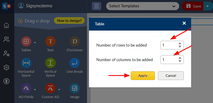
- Drag and drop the custom table component into the design pane.
- Enter the number of rows and columns to be added and click the ‘Apply’ button
Table properties:
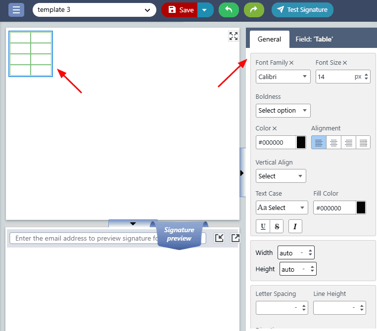
To set the table properties, click on the table and set the required properties from the ‘General Pane’ on the right side of the Sigsync Editor
The following are the various table properties
- Font Family: This property allows you to choose the font type for your table text.
- Font Size: Adjust the size of your table text.
- Boldness: This property determines the thickness of your table text.
- Color: Choose the color of your table text to match your brand or style.
- Font Style: Select the style of your font, such as Normal or Italic, to enhance the visual appeal of your table.
- Fill color: This sets the background color of the table.
- Alignment: This sets the horizontal alignment of the table within its container.
- Height: This sets the height of the table.
- Width: This sets the width of the table.
- Top padding: This sets the amount of padding between the top of the table and its contents.
- Right padding: This sets the amount of padding between the right of the table and its contents.
- Bottom padding: This sets the amount of padding between the bottom of the table and its contents.
- Left padding: This sets the amount of padding between the left of the table and its contents.
- Top border: This sets the border of the top of the table.
- Right border: This sets the border of the right of the table.
- Bottom border: This sets the border of the bottom of the table.
- Left border: This sets the border of the left of the table.
- Border all: This sets the border of all sides of the table.
- Border width: This sets the width of the table's border.
- Border style: This sets the style of the table's border.
- Border color: This sets the color of the table's border.
- Border separate: This separates the borders between cells in the table.
- Border collapse: This collapses the borders between cells in the table.
- Background image: This sets the background image of the table.
Table cell properties:
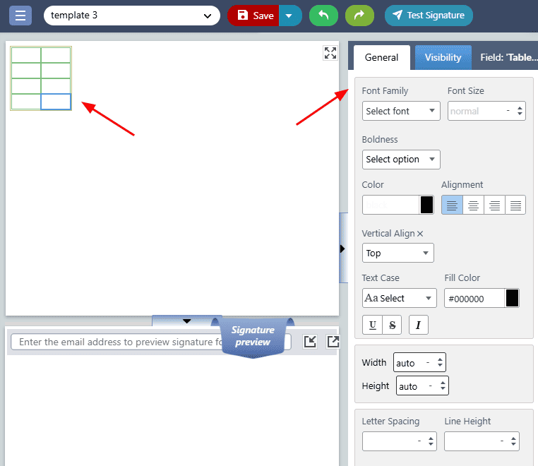
Table cell properties allow you to customize the individual cells within a table. By clicking on a cell within a table, you can access the table cell properties from the ‘General ’ tab on the right-hand side of the editor.
To set the table cell properties, click on the table and set the required properties from the ‘General’ tab on the right side of the Sigsync Editor.
The Table cell properties include:
- Font Family: This property lets you select the type of font you want to use for the text within the table cells.
- Font Size: This property enables you to adjust the size of your table cell text
- Boldness: This attribute determines how thick or bold the text within your table cells appears.
- Color: With this property, you can choose a color for your table text that complements your brand or matches your design scheme.
- Font Style: This option allows you to choose a style for your font, such as Italic or Normal, to give your table a more visually appealing look.
- Fill color: This sets the background color of the cell.
- Vertical alignment: This sets the vertical alignment of the content within the cell.
- Horizontal alignment: This sets the horizontal alignment of the content within the cell.
- Height: This sets the height of the cell.
- Width: This sets the width of the cell.
- Top padding: This sets the amount of padding between the top of the cell and its contents.
- Right padding: This sets the amount of padding between the right of the cell and its contents.
- Bottom padding: This sets the amount of padding between the bottom of the cell and its contents.
- Left padding: This sets the amount of padding between the left of the cell and its contents.
- Top border: This property sets the border of the top edge of the table cell.
- Right border: This property sets the border of the right edge of the table cell.
- Bottom border: This property sets the border of the bottom edge of the table cell.
- Left border: This property sets the border of the left edge of the table cell.
- Border All: This property sets the border of all four edges of the table cell.
- Border width: This property sets the width of the table cell's border.
- Border style: This property sets the style of the table cell's border. It can be solid, dashed, dotted, double, groove, ridge, inset, outset, or none.
- Border color: This property sets the color of the table cell's border. It can be specified using color names, hex codes, or RGB values.
- Border separate: This property separates the borders between cells in the table. If set to separate, each cell will have its own border, while if set to collapse, adjacent cells will share a border.
- Border collapse: This property collapses the borders between cells in the table. If set to collapse, adjacent cells will share a border, while if set to separate, each cell will have its own border.
- Background image: This property sets the background image of the table cell
- Split rows: This property allows you to divide a single row into two or more rows.
- Merge cells: This property allows you to merge two or more cells into a single cell.
- Insert row: This property allows you to add a new row.
- Insert column: This property allows you to insert a new column.
- Delete row: This property allows you to remove a row from the table.
- Split column: This property allows you to divide a single column into two or more columns.
- Delete column: This property allows you to delete the currently selected column.
- Display / Hide Signature Fields: This allows you to show or hide specific signature fields within the cell.

